skip to main |
skip to sidebar
This is yet another cheap Chinese iPhone copy. Saw this one in a shop window in Hong Kong and went in to check it out.
 First thing I noticed on the box was how close to the iPhone the interface looked. No wonder, since it is a screenshot of an actual iPhone interface, including the AT&T carrier showing. Apart from that, the only noticeable design difference on the box between this imitation and the actual iPhone is two buttons on each side of the main middle button; two softkeys and phone "pick up / hang up" keys.
 The actual main screen of the phone is not iPhone-like. Rather it looks like most other phones out there in the market with wallpaper, time and date and the carrier (in this case it was the vendor's sim card showing "HT Macau") and a few other icons.
 The iPhone-looking interface is accessed when clicking on the tiny "Menu" icon. It shows icons very similar to those of the iPhone, including those for Google Maps, Pictures and Notes. Looking more closely reveals that these are not actually taken from the iPhone interface directly, but rather cheap imitations without the level detail found on the iPhone. See the details in the flower for example, or the route number and lines in the Google Maps icon.
 Most of these don't lead to their respective functionality found on the iPhone. The Camera icon leads to a confusing MP3-player-like interface. We couldn't get the camera working so the vendor assumed it was simply defective. The Google Maps icon leads to a phone book, which has a design similar to that commonly found on other phones, as illustrated here on the right.
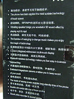 Finally the back of the box provided a list of the phone's functions, not without bit of humour with classic Chinglish. Notice the reference to the "megapixels" camera. Nowhere were we able to find out how many megapixels exactly the camera supports, if it actually works at all.You just wonder, if they're going to go through the trouble and cost of actually manufacturing and distributing a working mobile phone, couldn't they actually just make it a half-decent?Apologies for those who would really want to get their hands on one for whatever reasons; we didn't take note of the manufacturer or the name of the phone.
The Hong Kong Design Association (HKDA) in collaboration with the Hong Kong Design Centre (HKDC) held the HKDA AWARDS 07 BEST OF THE BEST EXHIBITION. The theme for the awards this year was “DESIGN. NO JUNKFOOD” which was intended to be “a statement on the value of design, and a trumpet call to all professional designers throughout Asia Pacific - bring forth [their] works of excellence”.
 Exhibition header designed by the HKDC
The awards are claimed to be a selection of the best designs from 1,600 submissions from all over Asia-Pacific, in graphic, product, spatial and new media design categories. Since most winning entries were from Hong Kong, one could wonder how many of the submissions were from other countries. Considering Hong Kong is far behind Japan, Korea and even Singapore in terms of creativity and innovation, it is likely that the call for submission had a limited reach.
The claim of regional excellence only made the results that more surprising. Apart from a few exceptions in interior design and graphics, most entries were far from showing creativity or innovation. Apart from dated designs and recycled ideas, the most striking thing about the awards was the apparent lack of any strong rationale behind most designs. And since no justifications for the winning selections were provided, there was nothing to infirm this impression.
Interestingly, many winning entries were from designers who happened to also be on the executive committee of the HKDA or HKDC. For example, HKDA’s Vice-chairman Winnif Pang (Winnif Studio Ltd.) won multiple awards in product design, while HKDC Vice-chairman Freeman Lau’s (Kan and Lau Design Consultancy), won in many in other categories.
Following are a few examples of the winning entries for you to judge the quality of the winning entries by yourself.Moody Disc(Silver award, Electronic & Electric Appliance, Winnif Studio) With a very 80’s style plastic techno design, this “2.1 Woofer-in Speaker” is a speaker with built-in FM radio tuner allows you to adjust the volume by repeatedly waving your hands on either side of the player. It also has white lights that can flash through the semi-transparent plastic.
Since the motion-detection works only within a few inches of the machine, people would most likely quickly start using the volume adjustments buttons on the machine or on their MP3 player instead. The product also has a headphone jack, suggesting that people would want to put this device between their MP3 player and their headphone... only for the pleasure of adjusting the volume by waving their hands?
Relaxing Spa Light(Silver award, Domestic Accessory, Winnif Studio) This is basically a small round plastic casing around a red and blue light, and an electronic chip that can emit sound samples of waves, flowing water, insects or birds chirping. It can also float. The name suggests it can create a spa experience.
See the posterPepper and Salt Vibrator
(Bronze award, Domestic Accessory, Winnif Studio)
 Battery-operated and electric pepper or salt grinders have exist for a while. These can save people the strain of twisting repeatedly, which can be useful for professionals who cook a lot, or for restaurant waiting staff. But this award-winner is a shaker, designed to “automatically vibrate you salt and pepper out effectively and decently”.
Redwhiteblue: here/there/everywhere
(Gold award, Publication category, Stanley Wong)
 The gold award in the publication category went to the book “Redwhiteblue here/there/everywhere”, which was launched in 2005 and has been featuring in many other award, books and event in Hong Kong since. This is simply another application of the red, white, and blue theme the designer has been applying since 2000 to everything from posters to interior design, inspired by the same colored durable nylon bags often seen in Hong Kong.
The designer, Stanley Wong, also happens to be a on the executive committee of the HKDA.
Best of the Best?
I don't know about you, but if this is not junk food, it nonetheless left me still hungry for something more aesthetically and intellectually nourishing. The awards simply highlighted Hong Kong’s lack of creativity and went to prove once again that there perhaps more than anywhere, it’s not what you know but who you know that counts. If that is the best Hong Kong has to offer, then you just wonder what would their junk actually be like?
 First thing I noticed on the box was how close to the iPhone the interface looked. No wonder, since it is a screenshot of an actual iPhone interface, including the AT&T carrier showing. Apart from that, the only noticeable design difference on the box between this imitation and the actual iPhone is two buttons on each side of the main middle button; two softkeys and phone "pick up / hang up" keys.
 The actual main screen of the phone is not iPhone-like. Rather it looks like most other phones out there in the market with wallpaper, time and date and the carrier (in this case it was the vendor's sim card showing "HT Macau") and a few other icons.
 Most of these don't lead to their respective functionality found on the iPhone. The Camera icon leads to a confusing MP3-player-like interface. We couldn't get the camera working so the vendor assumed it was simply defective. The Google Maps icon leads to a phone book, which has a design similar to that commonly found on other phones, as illustrated here on the right.
 Finally the back of the box provided a list of the phone's functions, not without bit of humour with classic Chinglish. Notice the reference to the "megapixels" camera. Nowhere were we able to find out how many megapixels exactly the camera supports, if it actually works at all.


